.png)
A website built around the lab down the hall.
The Smile Designer makes its veneers, crowns and dentures in its own lab, in the same building as the chair. We planned, designed and built a site that makes a stranger understand what that means. Since launch, the practice reports a 27% improvement in conversion.
The brief
Twenty-five years of careful dentistry. A few seconds to prove it.
Someone choosing a cosmetic dentist usually has three tabs open and a phone in one hand. Every practice in those tabs says it is experienced, gentle and modern. Very few give the visitor a reason to believe it.
The Smile Designer had three reasons most practices can't claim. The job was to put them where a patient would actually see them.
A dental lab in the building
Crowns, veneers and dentures are made on site, not couriered to a technician who never sees the patient. It is the biggest difference between this practice and the next one, and the hardest to explain in a sentence.
The dentist does the design
Dr. Idriss holds Fellowship and Mastership with the International Congress of Oral Implantologists and has practiced for more than 25 years. Patients see her, not a rotation of associates.
A consultation worth booking
Imaging on site, time with the dentist and a written plan with a timeline, at no charge. An offer like that only converts if the visitor can picture what happens when they walk in.
How it came together
Planned as an argument. Designed and built to make it.
Most dental sites start from a template and fill in the blanks. This one started from the question a new patient is asking at each point on the page, and worked out what the practice had to say back.
One question per section
- Pinned down the three things this practice has that the other tabs don't: the lab, the dentist, the consultation.
- Ordered the page by what a stranger needs next: what is this, why trust her, what happens at the visit, why it's different, what do I need, show me.
- Put one consultation action at the end of every step, so there is never a section without a next move.
A room that matches the fee
- Presented a full concept for sign-off before building anything.
- Dr. Idriss approved the structure and asked for it to feel more luxurious, so the palette moved from navy to a deep oxblood.
- Turned the lab from a line in a feature list into a side-by-side comparison a patient reads like a story.
Built in Webflow, measured from day one
- Tap-to-call and a consultation button in the header on every screen, plus a skip link straight to the form for keyboard and screen-reader users.
- Every treatment in the chooser links to its own page with its own URL, so each one can be found in search.
- Launched with Google Tag Manager in place, so calls and form requests could be counted from the first day.
Section by section
What we built, and why it's there.
Screenshots from the live homepage. Each one shows a decision a patient never notices, only feels.
The promise, the proof and the phone number, together
A headline that names the work (veneers, implants, full mouth makeovers) and the lab in the first line. Under it, plain facts instead of adjectives: 25+ years in practice, 5,000+ patients, same-day appointments, Spanish spoken.
Explain the visit before asking for it
Three steps, one line each: X-rays and 3D imaging taken here, time with Dr. Idriss, a clear written plan with a timeline. People book what they can picture, so the page answers what actually happens?
before the button appears.
Introduce the dentist as a person, with receipts
Headed The dentist you will actually see.
Her degree, school and year, implantology Mastership, memberships and sedation certification are listed in full rather than summarized into the word experienced
.
Most practices mail your smile to a stranger
A feature list would say in-house lab.
Instead the page follows one crown through two practices, from impression to fitting. The visitor draws the conclusion themselves, which is the only kind that sticks. The rest of the page is built to lead here.
Let people pick their reason for being there
Veneers, implants, Invisalign, dentures and everything else in one swipeable chooser instead of a long scroll. Every panel ends the same way: Consultation is complimentary
and a single button.

Show the work before quoting the reviews
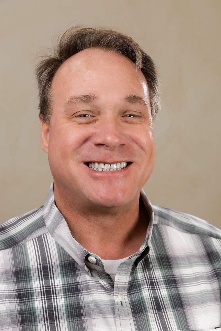
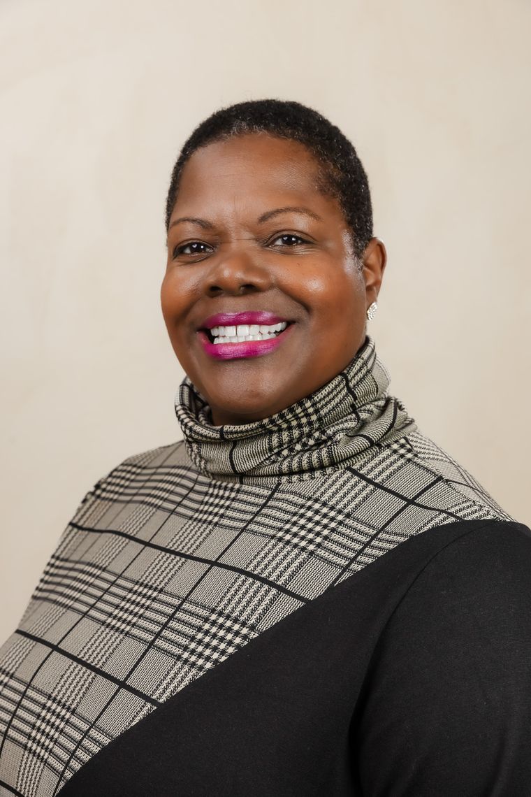
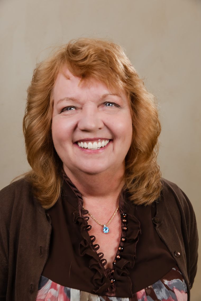
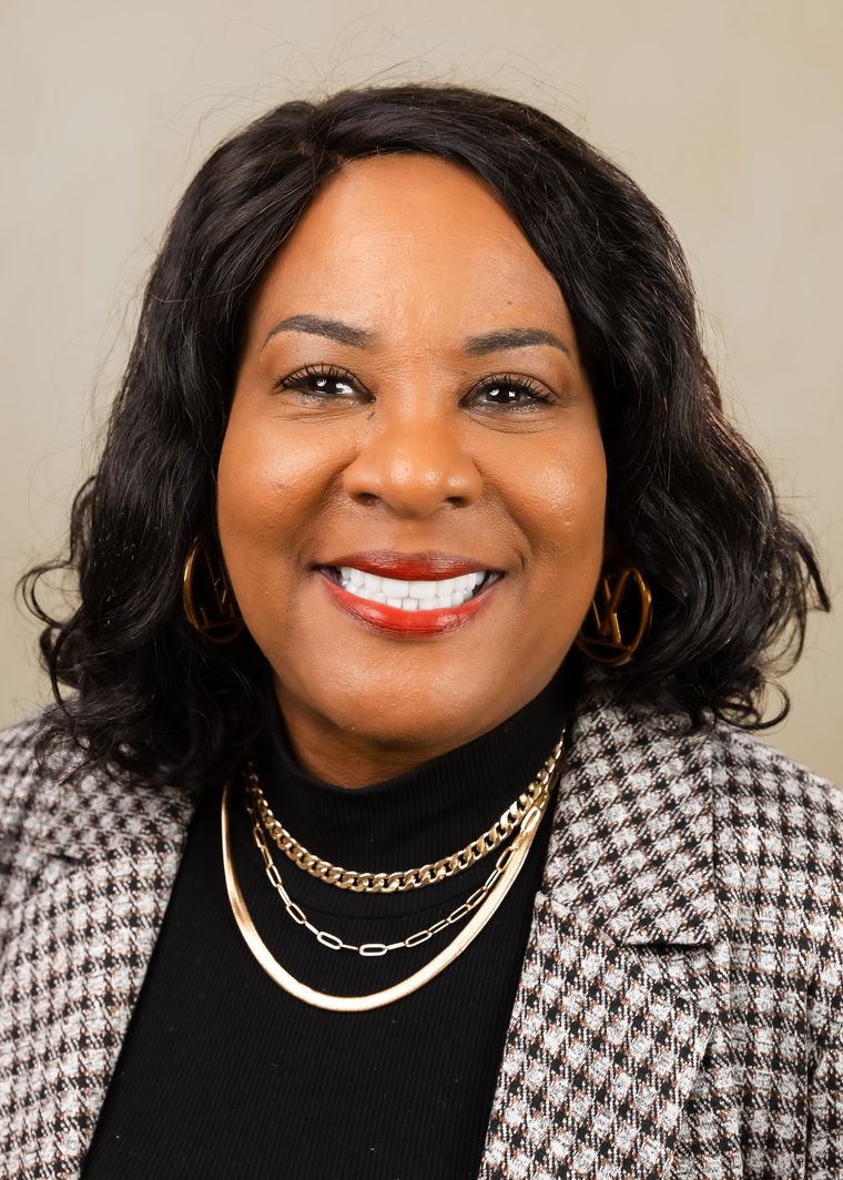
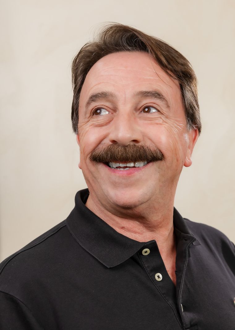
Real patients, photographed after treatment, come before the testimonials. For cosmetic dentistry the result is the proof. Reviews confirm it; they can't replace it.
On the phone
Where most patients will actually meet it.
The same sections at phone width. The call button stays one tap away the whole way down.
The revision
The concept was approved. Then it had to feel like the practice.
The first concept was built on navy. Dr. Idriss signed off on the structure and asked for one thing: make it feel more luxurious. We moved the whole palette to a deep oxblood and burgundy.
The argument of the page didn't change. The room it sits in did. For a practice selling veneers and full mouth makeovers, that sets the expectation for the fee.
The result
Same practice, same dentist. More of the visitors now book.
Nothing about the dentistry changed. What changed is how quickly a stranger understands why this practice is different, and how easy the page makes the next step.
The practice's Google Ads were already running on the account we rebuilt before the new site went live, so the lift reflects the website doing more with the traffic it was already getting.
Get a site like this for your practiceWe Would Love To Listen. Really!




.avif)
.avif)
.avif)
.avif)
.avif)